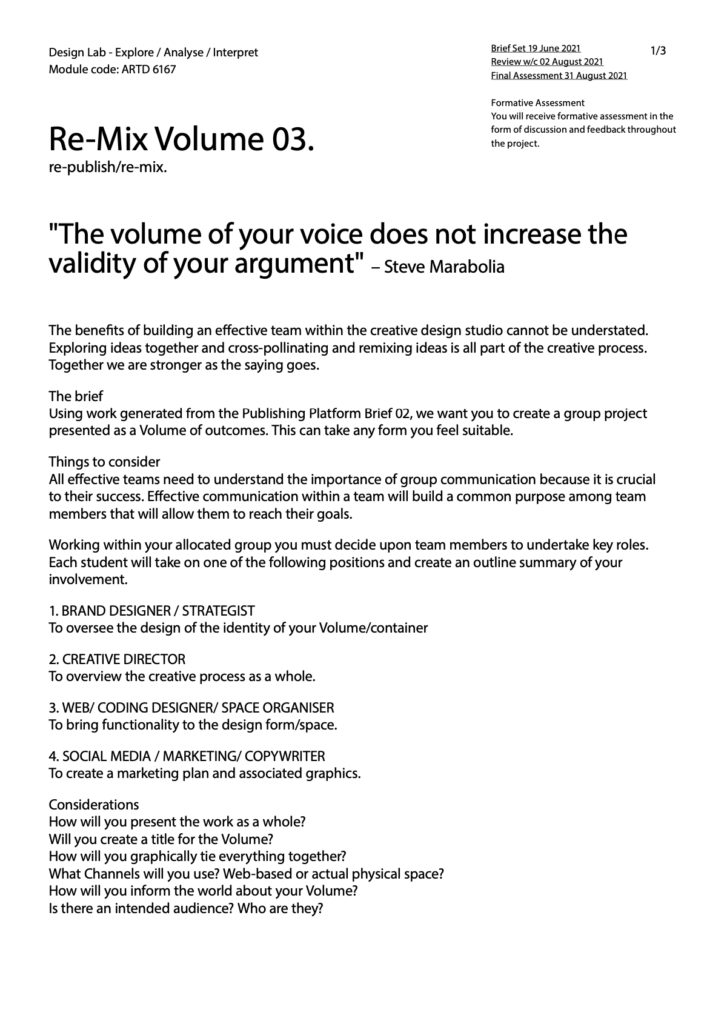
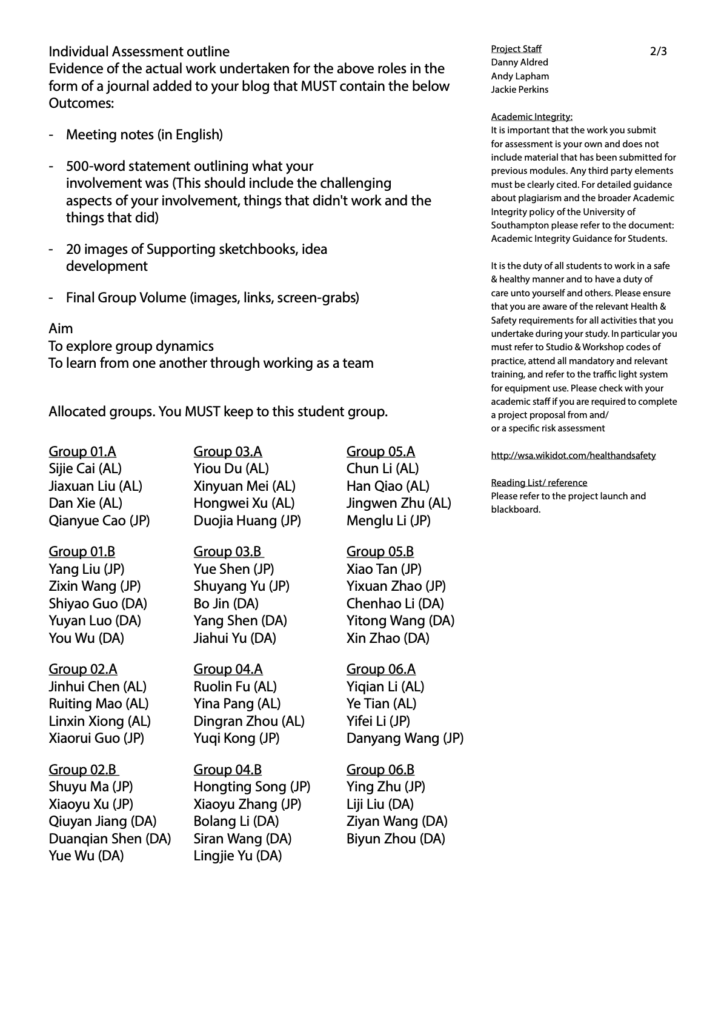
Brief/
Process/
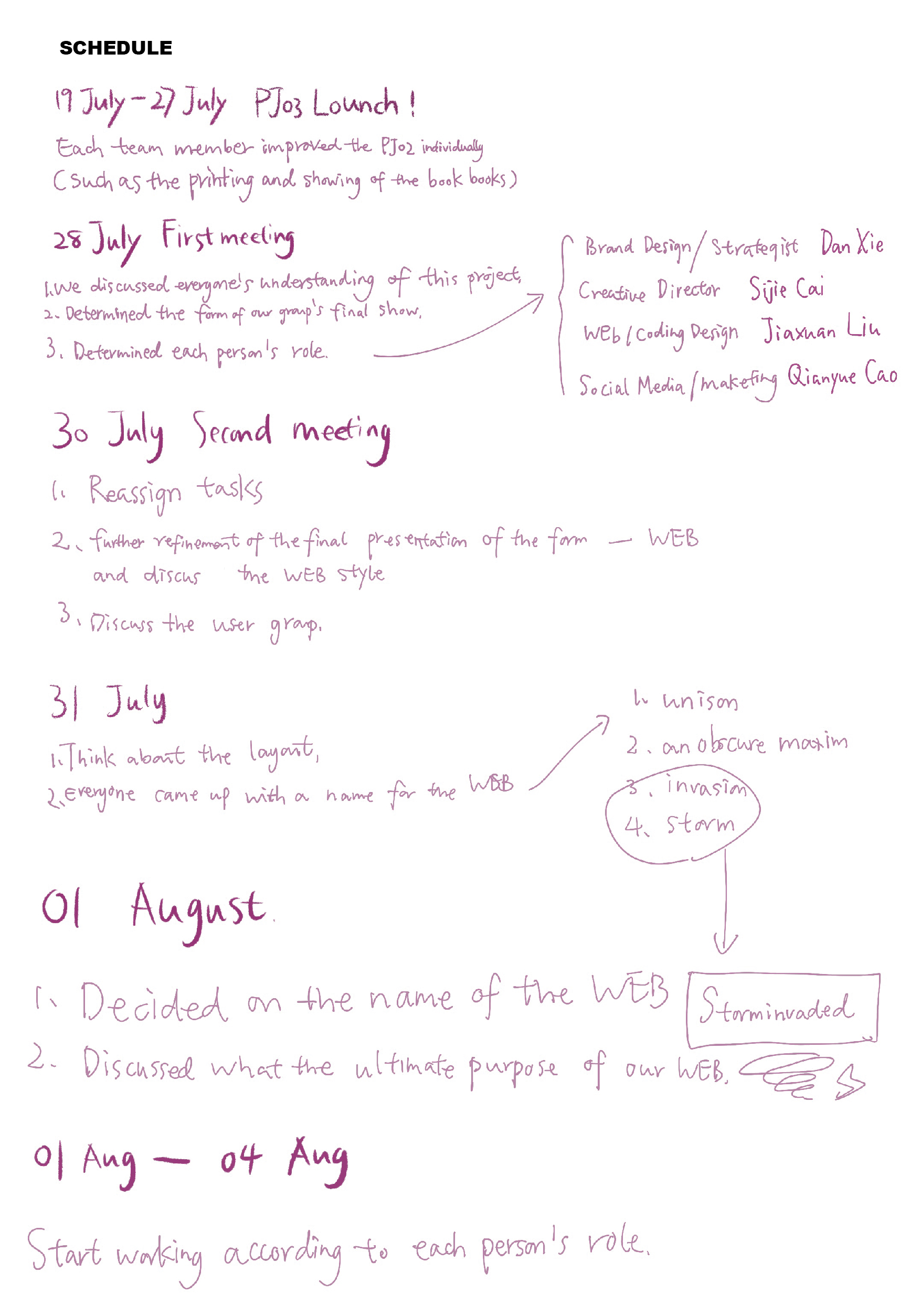
Meeting notes


Outcome/
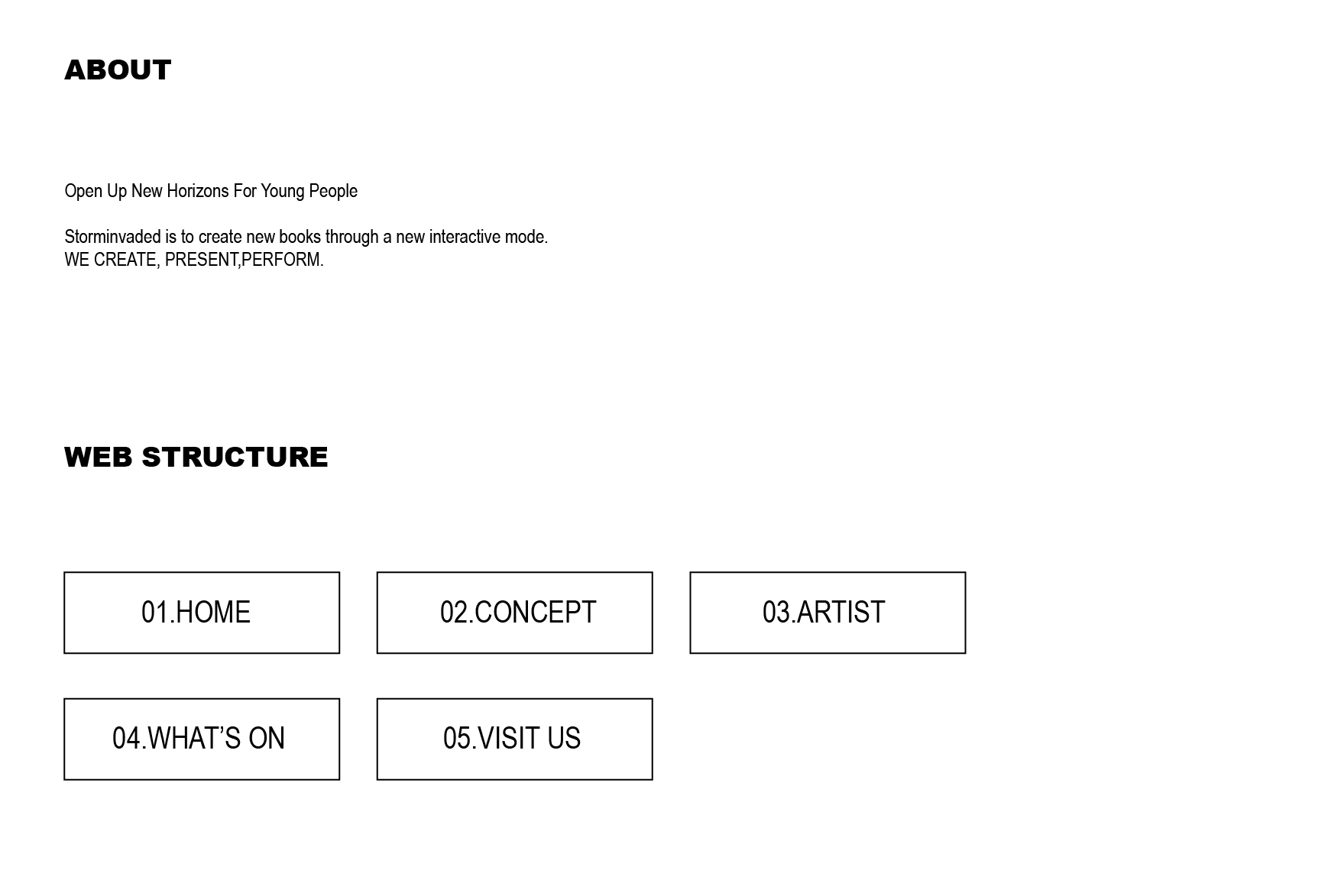

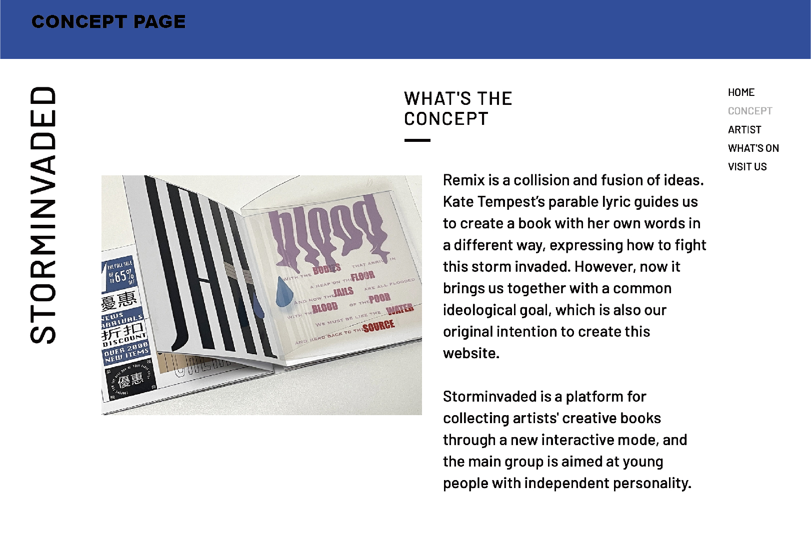
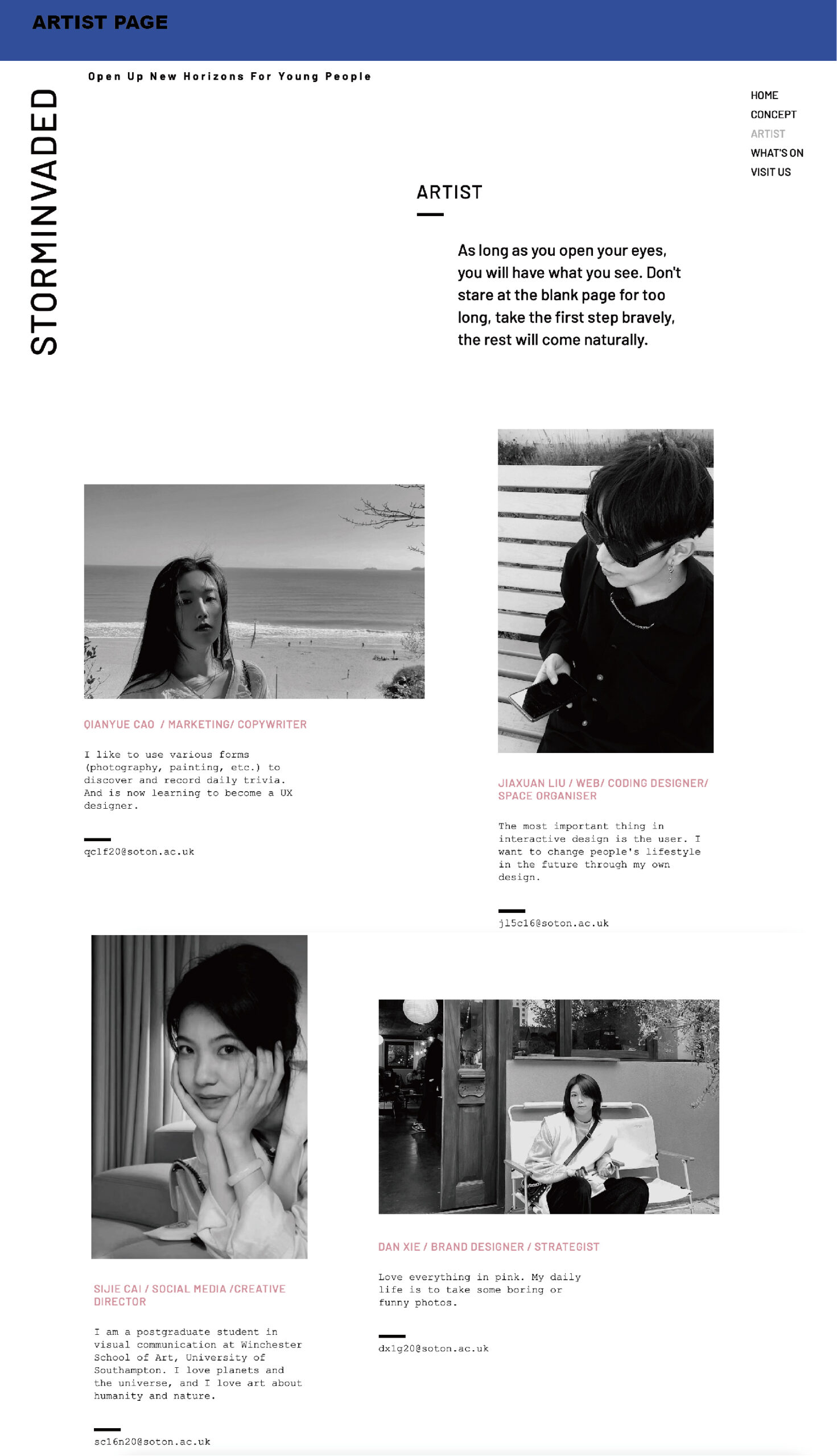
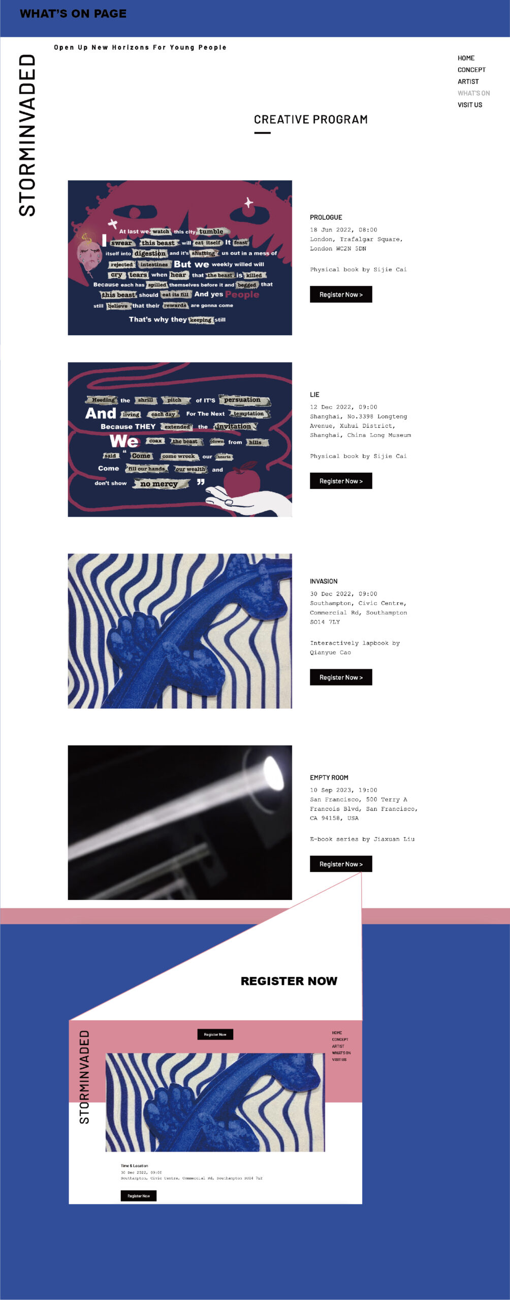

Link:https://yeesunl98.wixsite.com/storminvaded/concept
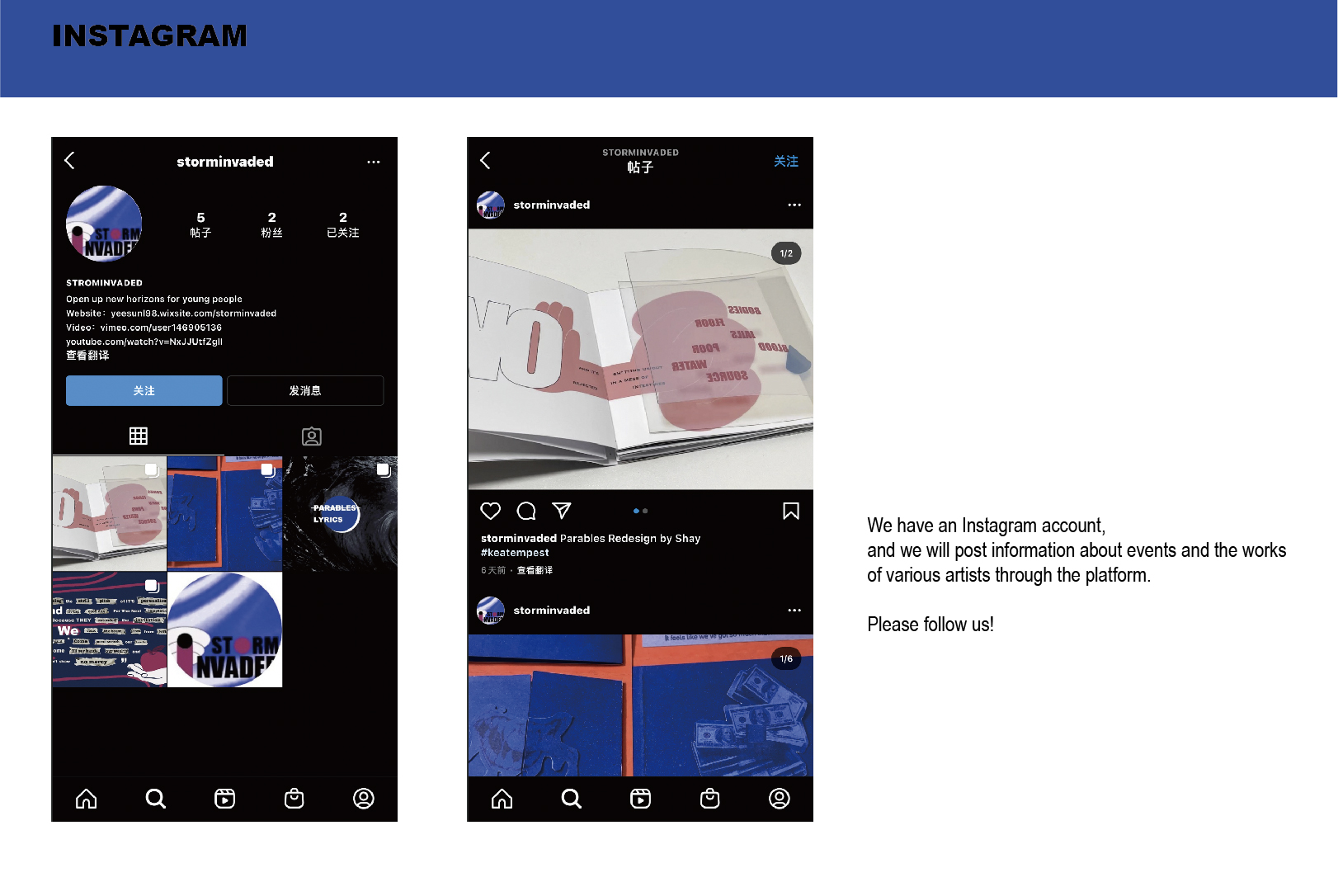
IG:storminvaded
Statement/
Since this project was launched in the form of group cooperation for the first time this semester, we attached great importance to it and held many meetings to finally determine that the final result of our team was to combine the work of each team member in the form of a website Presented as a collection. Based on the displayed content is the continuation of project2, in order to ensure the smooth progress of this project, our team’s early start-up progress is relatively slow so that everyone has enough time to adjust their project2 more perfectly, including some printing and shooting. As a Chinese saying goes: If you want to do something first, you must first sharpen your tools. But we all know that teamwork projects are not as flexible as individual projects after all. Everyone is not the same in time control. For us who are working as a team for the first time, it is a huge challenge to adjust everyone’s pace to unity. Another thing I find more distressing is that it is difficult for us to have face-to-face meetings because of the distance. This requires more online communication between team members. Almost every day we will report our progress and some unexpected ideas online. During the meeting, we started several brainstorming sessions and quickly determined that the user group of the website is 12-30 years old and the name of the website is storm invaded. This experience is a better experience than a personal project because you can listen to the opinions of the team members in a team meeting to get new inspiration, which is much better than hiding in a room and thinking about ideas all day.
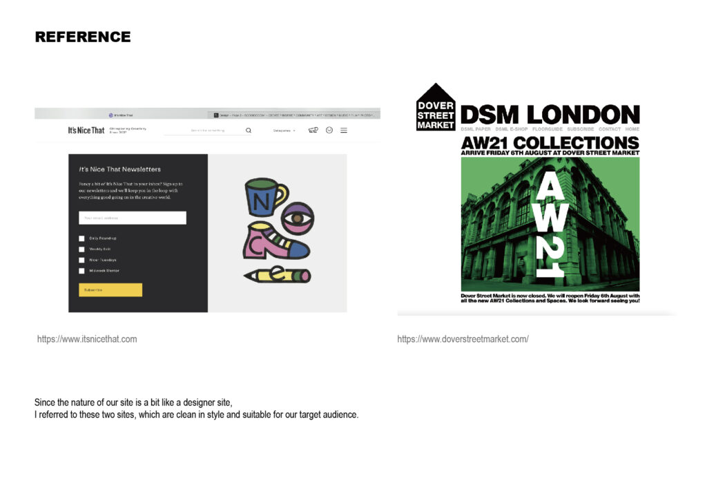
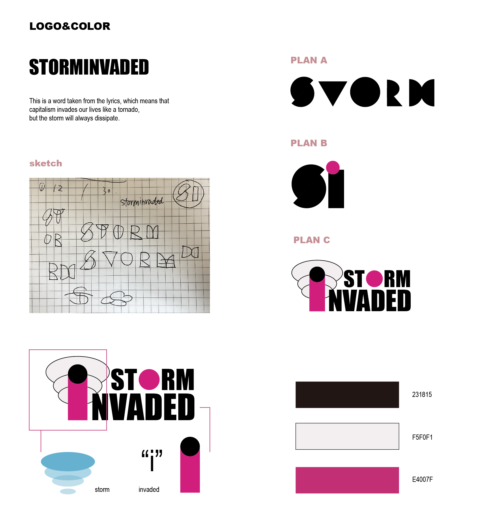
In this project, I was mainly responsible for the brand design and strategy part and part of the filming work. My point of view is that brand design is the first step in brand strategy, and visualizing the concept of our website is very difficult. So I refer to a large number of websites of the same type and study their logos, styles, and color schemes. As our user population is targeted at teenagers, the team members’ project2 is also dominated by colorful illustrations. I mainly took the website It is nice that as a reference, and designed a logo that combines cartoon vector graphics and letters for this purpose. The overall style of the website is simple and clean, with white as the main tone, supplemented by bright large color blocks (I chose the main color in the project2 of the team members). I also made a few simple animations. After discussion, our team finally selected one of them to put it on the homepage to make the whole website more interesting and visually impactful. This is what I think is a contribution to the project. a part of. For the design of the page, I need and be responsible
The website and coding design team members have more communication. We need to connect the parts that are responsible for each other. Whether it is in design ability or team cooperation, I believe that we have made an improvement compared to the previous stage (personal project).
Some of the useless things I did may be to name our website. Because our theme comes from the lyrics parable of kae, which means specifically the fables in the Bible, and the lyrics probably tell an obscure fable about capitalism, so I named it An obscure maxim. Now that I think about it, this name is really not direct enough, and it will make users wonder. Fortunately, we finally chose a more descriptive name.
All in all, I think that in this teamwork, our team cooperated very well. Everyone tried their best to do their own tasks and also helped the team members. The atmosphere is also very harmonious. I am also very grateful for this opportunity. Allows more interaction between students.
